The logo is the foundation of your brand, its business card, which forms the first impression of customers. It should be unique, memorable, and professionally executed. Adobe Illustrator is an ideal tool for creating logos, as it works with vector graphics, which allows you to scale the image without loss of quality.
A well-designed logo helps to stand out from competitors and build trusting relationships with customers. It should be universal: both in digital format and in print. Let’s get started!
Let’s look at why a logo is not just a picture, but a powerful branding tool. We’ll talk about how to create a logo that will work for you for years, and how to adapt it to modern trends without losing your brand identity.
You’ll find out:
- Basic principles of logo design.
- A step-by-step guide to working in Illustrator.
- Tips and tricks for creating a professional design.
- Examples of successful logos and their analysis.
Basics of Working in Adobe Illustrator
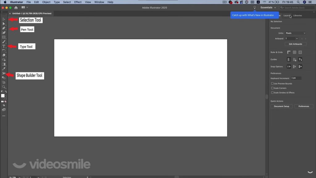
Illustrator Interface
Before starting to create a logo, it’s important to familiarize yourself with the program interface. Adobe Illustrator has an intuitive interface that can be customized for your tasks. Here are the key elements:
- Toolbar: Located on the left, it contains essential tools such as the Selection Tool , Shape Tool , Pen Tool , and Type Tool .
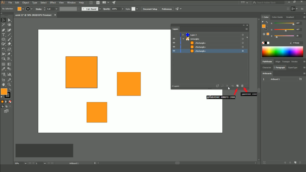
- Layers Panel: Allows you to manage layers, which is especially important when working with complex designs. For example, you can separate text and graphics into different layers for easier editing.
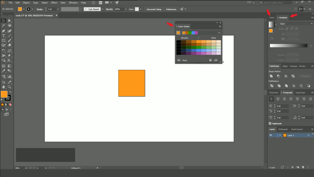
- Color Panel: Used to select colors and create palettes. Here, you can adjust shades, gradients, and transparency.
- Properties Panel: Displays parameters of the selected object, such as size, position, and fill.
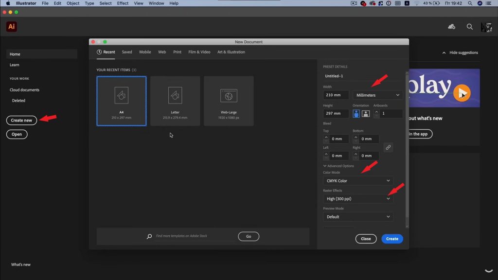
The first step is creating a new document. Here’s how to do it:
- Open Adobe Illustrator and click File > New .
- Set the canvas size. For logos, a square format is recommended, such as 1000×1000 pixels. This ensures versatility for use in social media or on business cards.
- Choose the color mode:
- RGB for web design (screens, social media).
- CMYK for printing (business cards, banners).
- Click Create to generate the document.
Basic Tools for Creating a Logo
- Shape Tool: Used to create basic shapes like circles, rectangles, and stars. These forms often serve as the basis for logos.
- Pen Tool: Allows you to draw custom shapes and create unique elements.
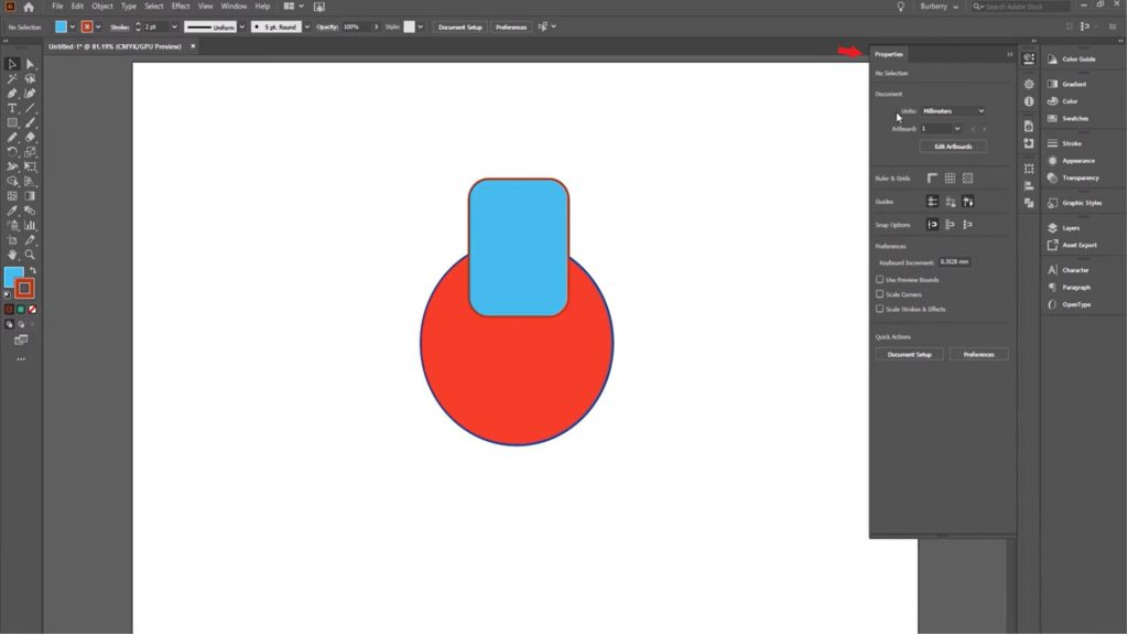
- Pathfinder: A tool for combining, subtracting, or intersecting shapes. For example, you can merge a circle and a triangle to create an abstract symbol.
- Type Tool: Adds text. You can customize the font, size, color, and placement of the text.
- Gradient Tool: Creates smooth transitions between colors.
Step-by-Step Logo Creation
Step 1: Creating a New Document
Let’s start by creating a new project:
- Open Adobe Illustrator and click File > New .
- Set the following parameters:
- Width and Height: 1000×1000 pixels.
- Color Mode: RGB (for web) or CMYK (for print).
- Resolution: 300 PPI (for high quality).
- Click Create to generate the document.
Step 2: Drawing Basic Shapes
Now let’s create the main elements of the logo:
- Select the Shape Tool (rectangle, circle, star) and draw a basic shape. For example, a circle can symbolize unity, while a triangle can represent movement.
- Use the Pathfinder to combine or subtract shapes. For example:
- Unite: Combines two shapes into one.
- Minus Front: Cuts the front shape out of the back one.
- Intersect: Leaves only the overlapping part of two shapes.
- Adjust colors via the Color or Swatches panel. For example, use your brand’s corporate colors.
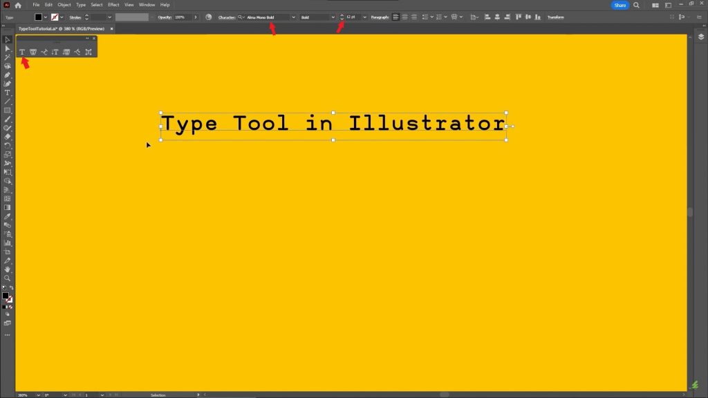
Step 3: Adding Text
- Select the Type Tool (T) and add your brand name.
- Customize the font:
- Sans-serif (e.g., Helvetica, Arial) for a modern style.
- Serif (e.g., Times New Roman, Georgia) for a classic look.
- Adjust the size, color, and placement of the text. For example, you can place the text inside a circle or next to a graphic element.
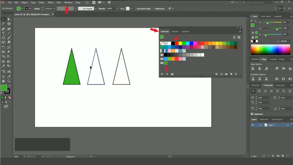
Step 4: Working with Colors
The color palette plays a key role in logo perception. Here’s how to choose the right colors:
- Open the Color or Swatches panel.
- Select your brand’s primary colors. For example:
- Blue for trust and reliability.
- Green for eco-friendliness and nature.
- Black for minimalism and elegance.
- Add gradients via the Gradient panel for a more dynamic effect. For example, a smooth transition from blue to purple creates a modern look.
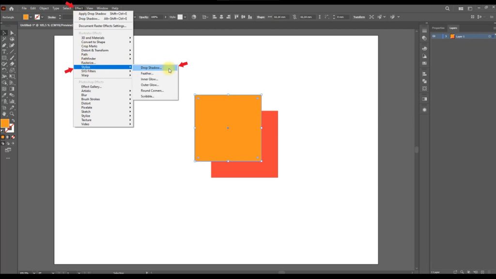
Step 5: Final Touches
- Check scalability: Zoom in and out of the logo to ensure it looks sharp.
- Simplify the design: Remove unnecessary elements. Remember, simplicity is key to success.
- Add details like shadows or textures if necessary. For example, you can add a subtle shadow via the Effects > Stylize > Drop Shadow panel.
Tips and Tricks
How to Choose the Right Fonts
- Use no more than two fonts in your logo. This creates a harmonious and professional look.
- Balance readability and uniqueness. For example, overly decorative fonts can be hard to read.
Color Harmony
- Use tools like Adobe Color to create harmonious color schemes.
- Avoid overly bright or contrasting colors unless they match your brand.
Mistakes to Avoid
- Overly complex designs. A logo should remain recognizable even when scaled down.
- Using trendy elements that quickly become outdated.
Examples of Successful Logos
Nike
- Minimalism: A simple checkmark conveys movement and energy.
- Versatility: The logo looks great on clothing, shoes, and advertisements.
Apple
- Simplicity: The apple outline is instantly recognizable.
- Associations: Symbolizes innovation and technology.
Starbucks
- Uniqueness: The siren and green color create a memorable image.
- Global appeal: The logo works across different cultures.
Take Stock
Now you know how to create a professional logo in Adobe Illustrator. The key is to remember simplicity, versatility, and alignment with your brand.
Create your logo right now and share your results in the comments! If you have any questions, feel free to ask — we’re always here to help.


Leave a Reply