Why Color Correction is Essential in Photography
Color correction is a crucial step in photo editing that not only fixes shooting errors but also adds emotional depth and professionalism to your images. Adobe Lightroom offers powerful tools for working with color, making it accessible to both beginners and experienced photographers.
Lightroom stands out with its user-friendly Develop panel, where all essential tools for adjusting exposure, white balance, and other parameters are conveniently organized. This makes it an ideal choice for anyone looking to enhance their photos without complex manipulations.
What You’ll Learn in This Article
In this article, we’ll cover the basics of color correction in Lightroom. You’ll learn:
- How to set up your workspace for efficient editing.
- Key tools for working with color.
- A step-by-step process for improving your images.
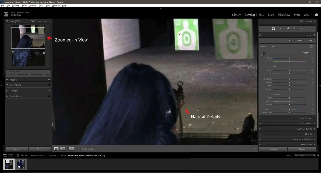
Setting Up Your Workspace for Efficient Editing
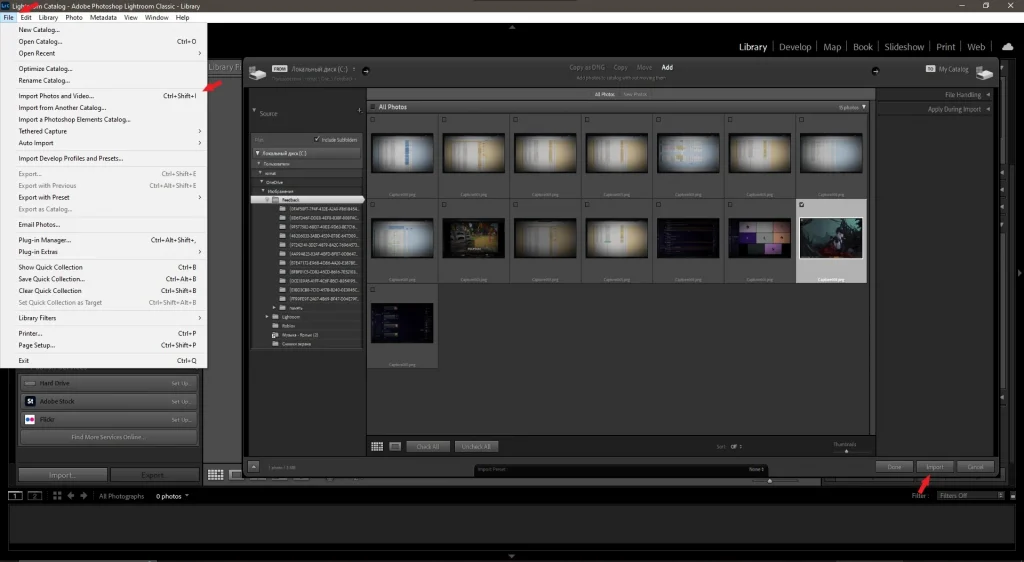
- Importing an Image into Lightroom
- Open Adobe Lightroom and select File > Import Photos and Video .
- Choose the image you want to edit and click Import .
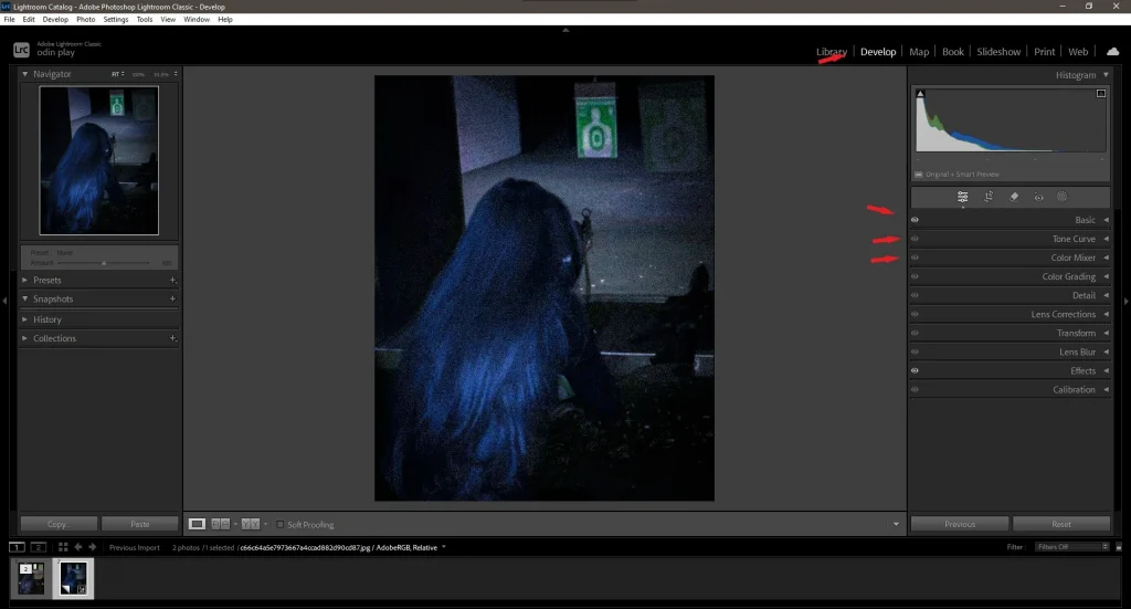
2. Configuring the Develop Panel
- Navigate to the Develop module (top-right corner).
- Here, you’ll find all the essential tools for color correction: Basic Panel , Tone Curve , HSL , and more.
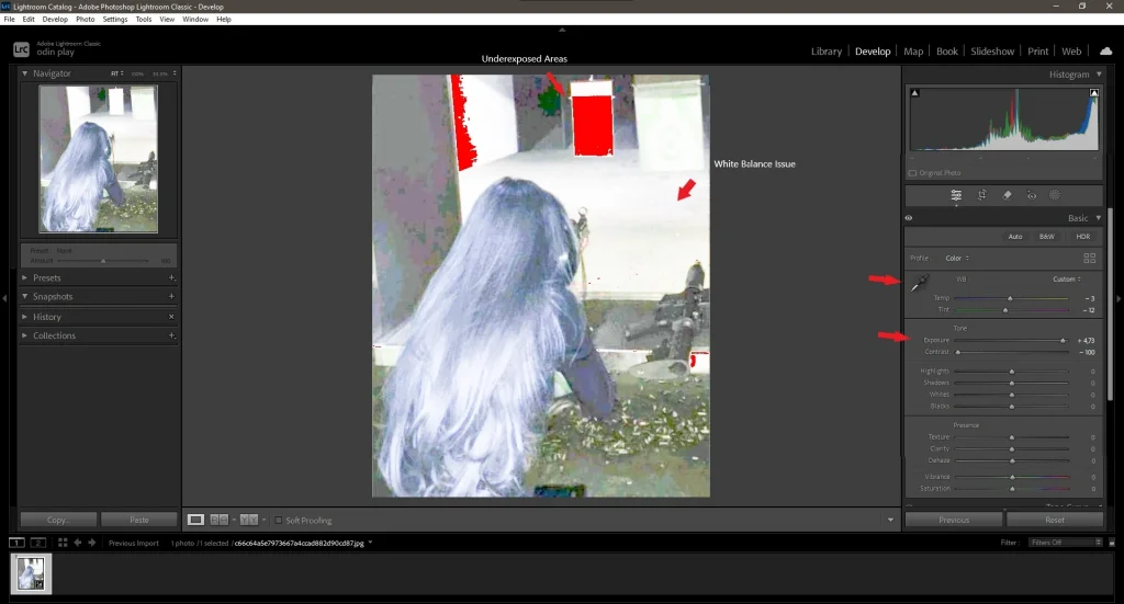
3. Analyzing the Original Image:
Before starting edits, carefully examine the original image. Pay attention to:
- White balance: Is it too warm or too cold?
- Exposure: Are there underexposed or overexposed areas?
- Contrast: Are details clearly visible?
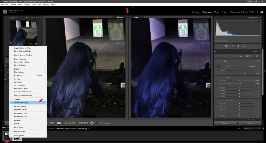
4. Creating a Backup Copy:
- Before editing, create a virtual copy of the image (Photo > Create Virtual Copy ) to preserve the original file for future experiments.
Mastering Color Correction with Essential Tools
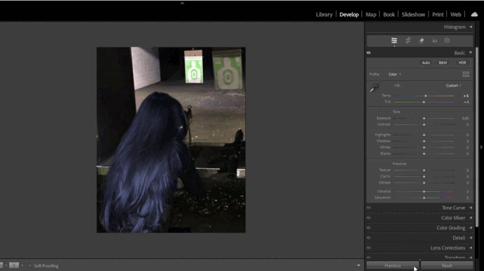
- White Balance:
This tool helps adjust the color temperature of your image. For example, if the photo appears too yellow, you can add more blue tones.- Use the Temperature slider to adjust warmth/coolness and the Tint slider to fine-tune green/magenta hues.
- For precise adjustments, use the Eyedropper Tool by clicking on a neutral gray area in the image.
- Tone Curve:
The Tone Curve allows you to fine-tune contrast and brightness.- Create an S-shaped curve by pulling the top part upward (to brighten highlights) and the bottom part downward (to darken shadows).
- You can also use point adjustments for specific areas of the image.
- HSL Panel (Hue, Saturation, Luminance):
The HSL panel gives you control over hues, saturation, and brightness.- For example, to make the sky deeper, reduce the Luminance of blue and increase its Saturation .
- If you want to change grass color, adjust the Hue of green tones.
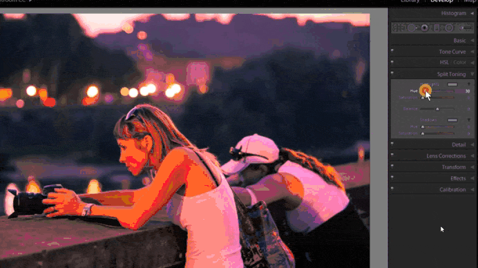
- Split Toning:
Split Toning adds color accents to highlights and shadows.- For instance, you can add a warm orange tone to highlights and a cool blue tone to shadows.
- Balance the colors to ensure the image looks harmonious.
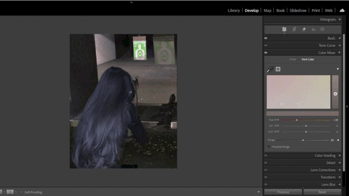
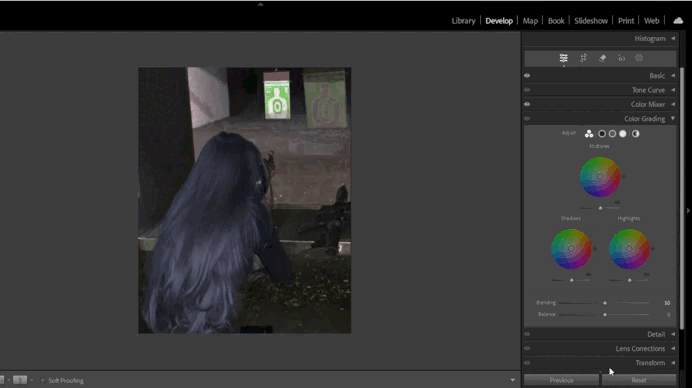
- Color Grading (New Feature):
Color Grading replaces the old Split Toning tool and offers more advanced options for working with color.- Use three circular palettes to adjust tones in highlights, shadows, and midtones.
- Add global color effects using the central circle.
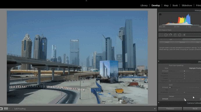
- Dehaze Tool:
This tool helps remove haze or add atmospheric effects.- Positive values reduce haze, making the image sharper.
- Negative values add softness and moodiness, perfect for artistic effects.
Step-by-Step Color Correction Process
1. Correcting White Balance
- Using the White Balance Tool:
- In the Basic panel, adjust the Temperature and Tint sliders.
- If automatic settings don’t work, use the Eyedropper Tool on a neutral gray area.
- Checking Results:
- Ensure colors look natural and match your creative vision.
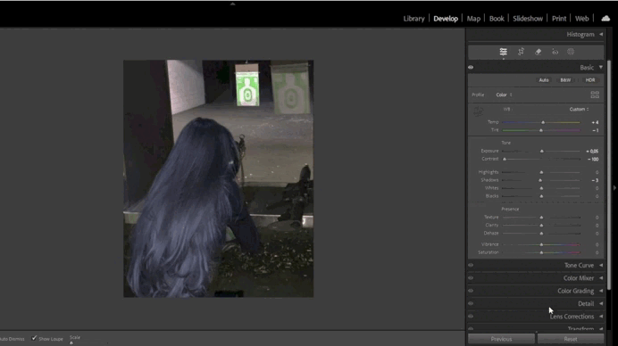
2. Adjusting Exposure and Contrast
- Fine-Tuning Exposure:
- Use the Exposure slider to brighten or darken the image.
- Enhance contrast with the Contrast slider or adjust Highlights/Shadows for precision.
- Enhancing Details:
- Use the Clarity and Dehaze sliders to add sharpness and remove haze.
3. Working with HSL for Better Colors
- Adjusting Hues:
- In the HSL panel, go to the Hue tab and tweak colors as needed.
- For example, make the grass greener or the sky bluer.
- Adding Saturation:
- Go to the Saturation tab and increase the intensity of desired colors.
4. Adding Split Toning Effects
- Using Split Toning:
- In the Split Toning panel, add warm tones to highlights and cool tones to shadows.
- Ensure the transition between colors feels natural.
5. Working with Color Grading
- Adjusting Midtones:
- Use the midtone palette to add depth to the image.
- For example, add a warm orange tone for a cozy atmosphere.
- Enhancing Highlights and Shadows:
- Add a cool blue tone to shadows and a warm yellow tone to highlights.
- Ensure the balance between tones is smooth and natural.
6. Using Dehaze for Atmosphere
- Adding Sharpness:
- Use positive Dehaze values to remove haze and enhance clarity, especially in landscape photos.
- Creating a Foggy Effect:
- Use negative Dehaze values to add softness and moodiness.
Enhancing Your Image with Final Adjustments
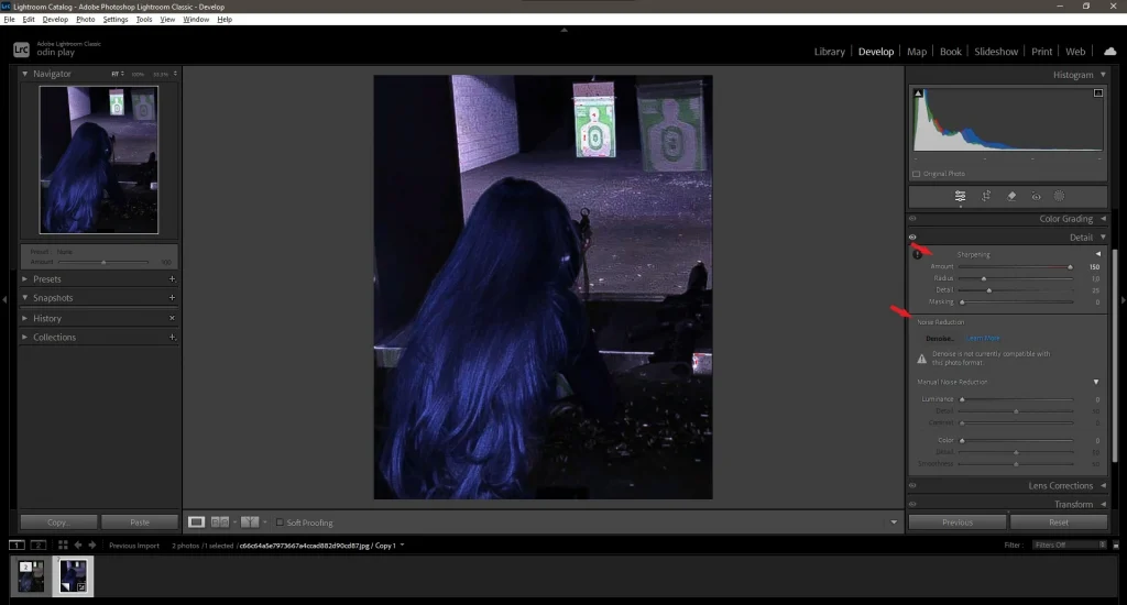
1. Sharpening:
- In the Detail panel, use the Sharpening and Noise Reduction sliders to improve detail and reduce noise.
- Increase the Amount for sharper details, but avoid overdoing it to prevent artifacts.
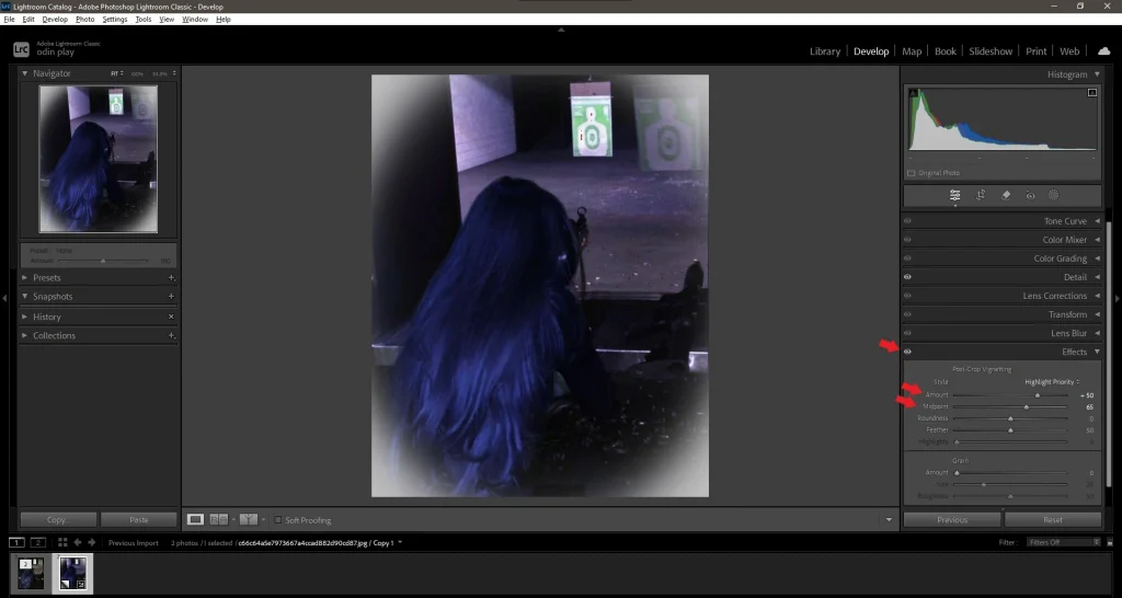
2. Vignette:
- In the Effects panel, add a vignette to draw attention to the subject.
- Use positive values to lighten edges or negative values to darken them.
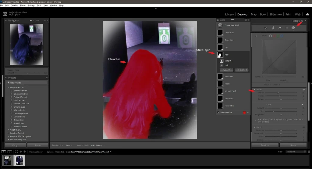
3. Adding Texture
- Create unique interactions, such as raising a hand or nodding the head.
- For example, you can add a trigger for raising a hand, activated by pressing the “H” key.
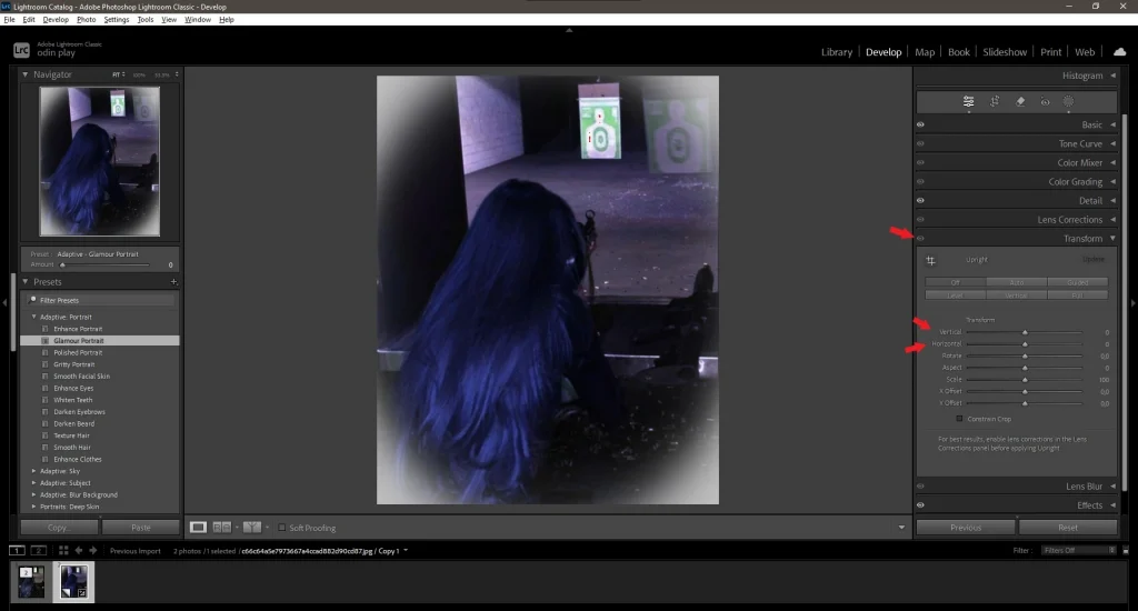
4. Correcting Perspective
- If the image has distortions, use the Transform tool.
- Adjust the Vertical and Horizontal sliders to straighten lines.
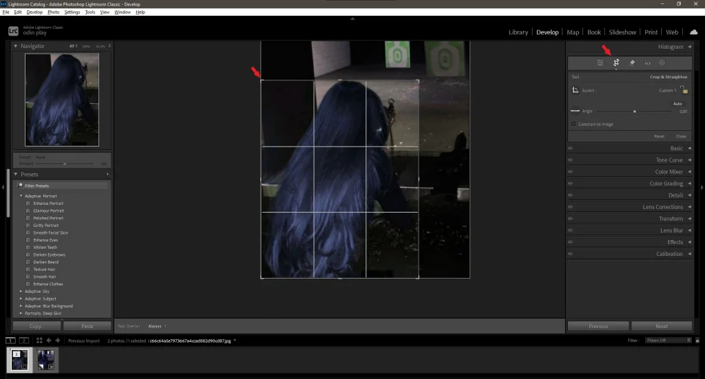
5. Using the Crop Tool
- Add sound effects to enhance the atmosphere. For example, footsteps or environmental sounds.
- To do this, select the Audio option in the Behaviors panel and upload a sound file.
6. Final Check
- Zoom in to 100% and review the edited image.
- Ensure all elements look natural and harmonious.
Exporting Your Photo for Web and Print
- Setting Export Parameters:
- Select File > Export .
- Choose the file format: JPEG for social media, TIFF for printing.
- Optimal Resolutions:
- For Instagram: 1080×1080 pixels (square format).
- For printing: 300 DPI and dimensions matching the physical format.
- Final Review:
- Preview the image on different devices to ensure colors and quality are consistent.
Pro Tips for Better Color Correction in Lightroom
- Use Presets:
- Presets allow you to quickly apply pre-configured styles. Create your own presets for recurring tasks.
- Save Backup Copies:
- Regularly create virtual copies to preserve previous versions.
- Check Results on Multiple Devices:
- Colors may vary across screens with different color profiles. Test your image on multiple devices before publishing.
- Experiment Freely:
- Don’t be afraid to try new combinations of tools. Some of the most interesting results happen by accident.
- Study Professional Work:
- Analyze edited photos by renowned photographers. Try replicating their style in Lightroom.
- Use the Histogram:
- The histogram at the top of the Develop panel helps monitor light and shadow distribution.
- Work with RAW Files:
- RAW format provides more data for editing, which is crucial when working with color.
Ready to Elevate Your Photos?
Now that you’ve learned the basics of color correction in Lightroom, it’s time to put these skills into practice. Start editing your photos, experiment with different techniques, and refine your skills.
Share your edited photos with us—we’d love to see what you’ve created!


Leave a Reply