
Why Are Fonts Important in Web Design?
Fonts are not just a tool for displaying text. They play a key role in how a website is perceived, influencing readability, aesthetics, and even branding. The right font can make a site look professional and memorable, while the wrong choice can ruin the entire impression.
When I first chose an unsuitable font, the site looked cheap. The text appeared blurry, headings got lost against the background, and the overall style felt amateurish. After switching to a high-quality font from Adobe Fonts, everything changed! The site started looking modern, the text became easy to read, and the design gained individuality.
For example, if you’re creating a site for a creative agency, decorative fonts will highlight your innovative approach. For a corporate site, classic fonts work better, conveying reliability and professionalism.
In this article, I’ll explain how to use Adobe Fonts in web design. We’ll start with the basics of working with the platform, learn how to choose the right fonts, integrate them into your project, and optimize them for fast loading. By the end, you’ll be able to create websites with professional typography that enhances user experience.
How to Get Started with Adobe Fonts
Registration and Access to Adobe Fonts
The first step to using Adobe Fonts is registering on the official website. You can find the platform here: Adobe Fonts . It’s a convenient resource with thousands of fonts available for use in web design.
To access the library, you’ll need an Adobe ID. If you don’t have one yet, register through a simple form on the Adobe website. After registration, you’ll be able to use all the platform’s features, including adding fonts to your projects.
One important note: many fonts in Adobe Fonts are free, but some require a Creative Cloud subscription. However, even the free options are enough for most projects.
First Look at the Adobe Fonts Library
When I first opened the Adobe Fonts library, I was amazed by how many free fonts were available! The platform’s interface is intuitive and easy to navigate.
On the left, there’s a filter panel that helps narrow down your search. You can choose fonts by category (e.g., “Serif”, “Sans Serif”, “Decorative”), language, popularity, or even specific characteristics like width or slant.
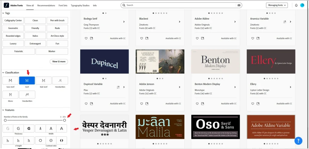
In the center of the screen, font cards are displayed with text examples. Each card contains information about the font family, author, and available weights (thin, bold, etc.). If you want to see how a font will look in action, simply click on it to open a detailed description and usage examples.

In this screenshot, you can see how well-organized the interface is. At the top is the search bar, and on the right is a button to add the font to your project.
Choosing the Right Fonts
Choosing fonts depends directly on the type of your project. For example, for a landing page with a focus on headlines, decorative fonts work best, while for body text, simple and readable fonts are ideal.
Here are a few tips to help you make the right choice:
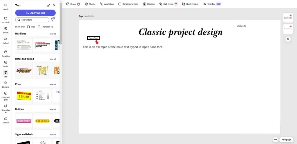
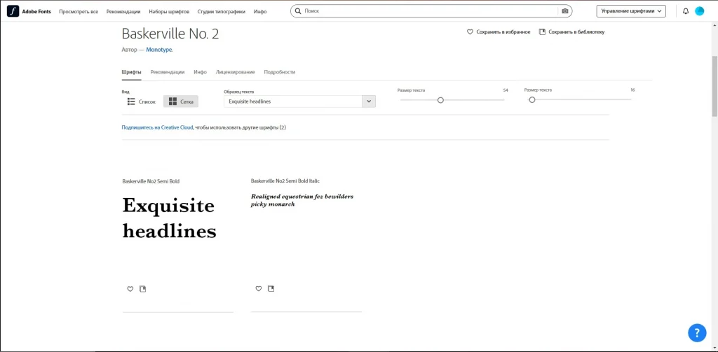
For Headings: Use decorative or bold fonts that grab attention. For example, Baskerville or Garamond works great for classic projects.

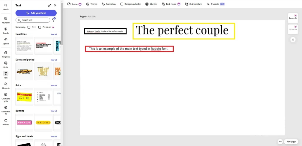
For Body Text: Choose sans-serif fonts like Roboto or Open Sans. They’re easy to read and look good on all devices.
Font Combinations: Try not to use more than two or three fonts in one project. For example, Roboto for body text + Playfair Display for headings is a proven combination.
Personally, I enjoy experimenting with different styles. Once, I chose a too-complex font for long text, and the client complained that it was hard to read. After that, I always check how easily the text is perceived.
How to Integrate Adobe Fonts into Your Website
Setting Up Fonts in CSS
Integrating Adobe Fonts into your website starts with adding a special code to your CSS. It’s easier than it sounds! After selecting the fonts you need on the Adobe Fonts platform, the system automatically generates a link for integration.
Here’s how it works:
- Go to the font page in Adobe Fonts and click “Add to Web Project.”

- Copy the provided code, which looks something like this:
css
@import url("https://use.typekit.net/yourprojectid.css");
3. Paste this code at the beginning of your CSS file or in the section of your HTML document.
Now you can use the selected fonts in your project. For example:
css
body {
  font-family: 'YourFontName', sans-serif;
}
h1 {
  font-family: 'AnotherFontName', serif;
}
Personally, I love using this feature because it allows me to quickly apply styles across the entire site. For instance, I once created a corporate website where I used just two fonts: one for headings and another for text. This made the design clean and professional.
Testing Fonts on the Site
After integrating the fonts, it’s important to test them on different devices. I always check fonts on mobile devices to ensure they remain readable. For example, once I chose a beautiful decorative font for headings, but on mobile, it turned out to be too small. I had to increase the text size to maintain readability.
Here are a few ways to test fonts:
- Live Preview: If you’re using Adobe Dreamweaver or other development tools, take advantage of the live preview feature.
- Different Devices: Open the site on a smartphone, tablet, and desktop. Check how the fonts look on each screen.
- Online Tools: Use services like BrowserStack or Responsively to emulate how the site works on different devices.
It’s also important to check the contrast between text and background. I often use online tools like WebAIM Contrast Checker to ensure the text is visible even in bright lighting.
Optimizing Font Loading
Fonts can slow down your site if there are too many of them or if they’re poorly optimized. To minimize their impact on loading speed, follow these tips:
- Use only the fonts you really need for the project.
Don’t overload the site with multiple styles. For example, one font for headings and one for text is enough. - Limit the number of font weights.
For instance, use only Regular and Bold instead of all available variants (Thin, Light, Medium, etc.). This reduces the font file size. - Use modern font formats.
Adobe Fonts automatically provides fonts in WOFF2 format, which is supported by most modern browsers and takes up less space. - Add the font-display attribute.
This parameter controls how fonts are displayed during loading. For example:
css
@font-face {
  font-family: 'YourFontName';
  src: url('https://use.typekit.net/yourprojectid.woff2') format('woff2');
  font-display: swap;
}
The swap attribute allows text to be displayed with a system font while your font is loading. This improves user experience.
I always check the site’s loading speed using tools like Google PageSpeed Insights or GTmetrix . If fonts slow down the loading, I remove unnecessary files or reduce their size.
How to Improve Typography with Adobe Fonts
Creating a Harmonious Font Combination
Creating a harmonious font combination is an art that requires attention to detail. Here are some principles to help you avoid mistakes:
- Style Contrast: If you use a decorative font for headings, choose a simple and minimalist font for body text. For example, pairing Futura (decorative) with Lora (classic) creates a balance between modernity and elegance.


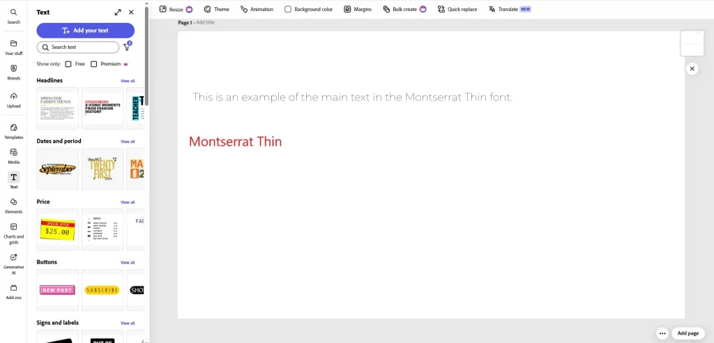
2. Same Family: If you want to use the same fonts for headings and body text, choose a family with a wide range of weights. For example, Montserrat offers variants from Thin to Black, allowing you to create hierarchy without complications.

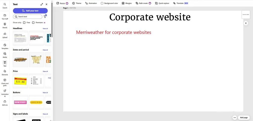
3. Emotional Connection: Fonts should match the atmosphere of the project. Playful fonts like Pacifico work well for creative blogs, while strict options like Merriweather are better for corporate sites.

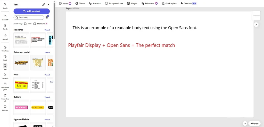
Example: “Open Sans for body text + Playfair Display for headings = a perfect pair!”
This combination works because Open Sans is a versatile sans-serif font that’s easy to read, while Playfair Display adds sophistication to headings.

Personally, I enjoy experimenting with unconventional pairs. For instance, I once used Oswald (geometric font) for headings and PT Sans (classic font) for body text. The result exceeded client expectations!
Working with Sizes and Contrast
Choosing the right font size and color is key to usability. Here are some unique approaches:
- Modular Scale: Use a modular scale to determine font sizes. For example, set the base text size at 16px and increase headings in a ratio of 1.5 (24px, 36px, 54px). This creates visual harmony.
- Color Accent: To highlight important elements, use color accents. For example, body text can be gray (#333333), while headings are bold blue (#007BFF).
- Accessibility: Always check the contrast between text and background. Personally, I use Contrast Ratio , which shows whether your design meets WCAG standards.

Personal experience: “Once, I designed a site with a dark background and light text. The client noted that their eyes got tired while reading. I added a softer background shade (#1A1A1A) and slightly increased the text size. The problem disappeared!”
Getting Feedback
Getting feedback is an important step to improve your project. Here are some unique ways to gather opinions:
- User Testing: Organize testing sessions where real users interact with your site. Ask specific questions:
1. How easy is it to find the information you need?
2. Which design element do you find most appealing?
3. Are there any moments that confuse you? - Behavior Analysis: Use tools like Hotjar or Crazy Egg to track how users interact with your text. For example, if they often scroll past sections, the text might be too long.
- Social Media Feedback: Post a screenshot of your design on Instagram Stories or Twitter with a question: “Which font do you like more: A or B?” It’s quick and effective.
Personal experience: “I once posted a screenshot of my project on Twitter and asked followers to choose between two font options. Most voted for option B, and I made the changes. The result was excellent!”
Why You Should Use Adobe Fonts in Web Design
Adobe Fonts is a powerful tool that simplifies working with typography and helps create professional websites. In this article, we covered the key steps: from choosing fonts and integrating them into your project to creating harmonious combinations and optimizing loading times.
Adobe Fonts is especially convenient thanks to its library of free fonts, which can be easily added to your project via CSS. We also discussed the importance of testing on different devices and gathering feedback to improve your design.
Good luck with your projects!


Leave a Reply