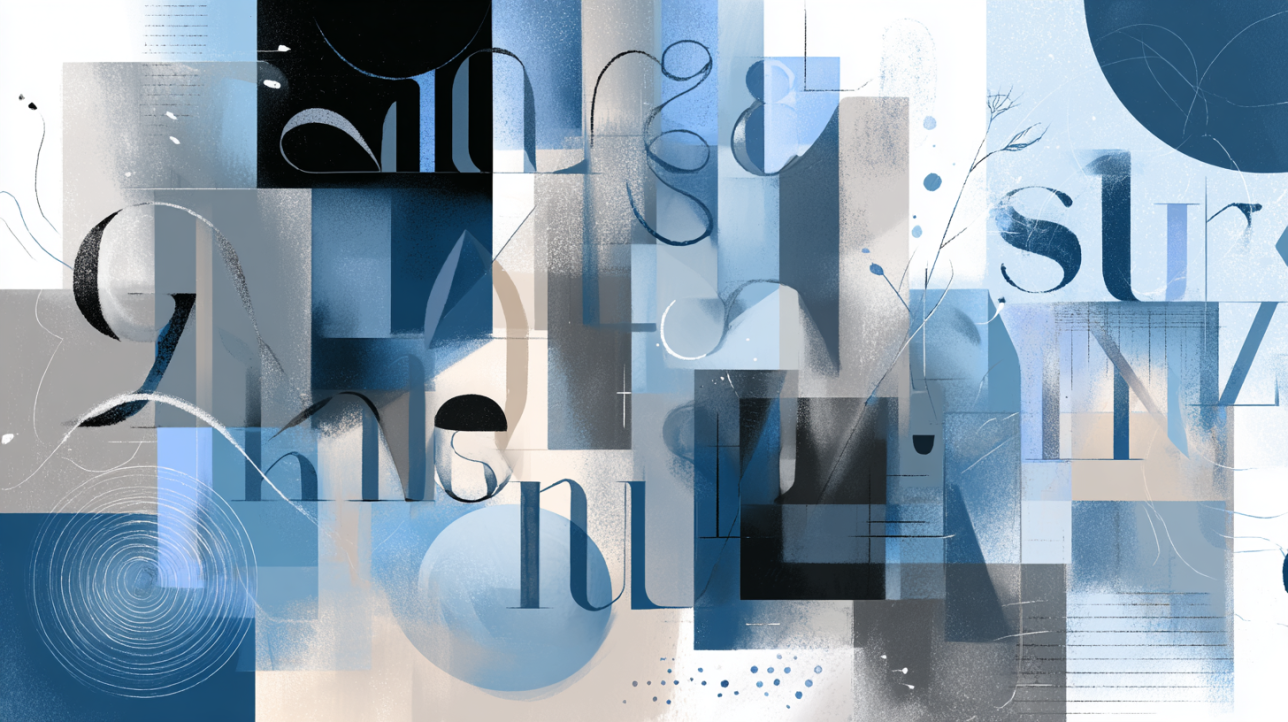
Typography plays a key role in design, shaping the perception of text and conveying the emotional component of a message. A well-chosen font helps amplify the idea, make the text more readable, and enhance its aesthetic appeal. The Adobe Fonts collection provides access to thousands of professional fonts that can be easily integrated into projects of any scale — from web design to print media.
In this article, we will explore the best fonts from the Adobe Fonts collection, their features, and examples of use. You will learn how to choose the right font for your project and how to combine fonts to achieve a harmonious result.
Best Serif Fonts from Adobe Fonts
Serif fonts feature small strokes (serifs) at the ends of letters, giving the text a classic and formal appearance. These fonts are often used in printed materials, logos, and other projects where elegance and professionalism are important.
What Are Serif Fonts?
Serif fonts are characterized by small horizontal or diagonal strokes at the ends of letters. They create a sense of stability and tradition, making them ideal for texts that require trust and authority.
Recommended Fonts:
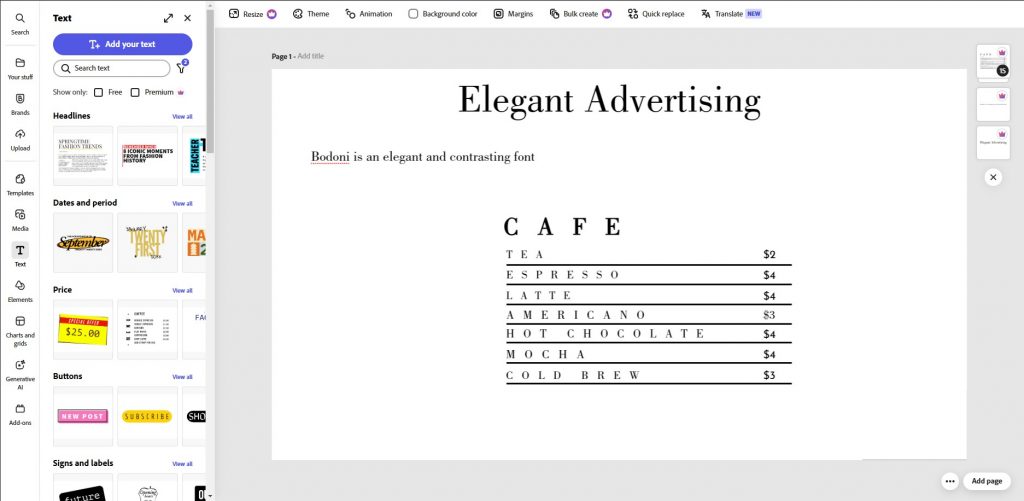
- Bodoni:
Features: Elegant and high-contrast font with sharp lines.
Examples of use: Advertising campaigns, book covers, logos.
- Garamond:
Features: Classic font with soft readability, perfect for large volumes of text.
Examples of use: Novels, magazines, documentary materials.

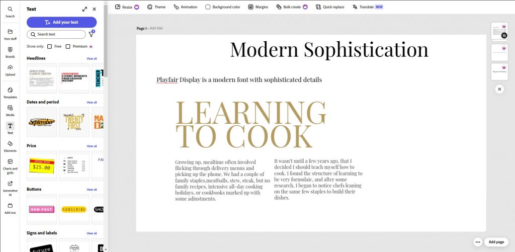
- Playfair Display:
Features: Modern serif font with sophisticated details.
Examples of use: Blogs, websites, presentations.
How to Use Serif Fonts?
Use serif fonts to create an academic or professional look.
Avoid them in interfaces where fast reading of small text is crucial (e.g., mobile apps).
How to Use Serif Fonts?
Use serif fonts to create an academic or professional look.
Avoid them in interfaces where fast reading of small text is crucial (e.g., mobile apps).
Best Sans-Serif Fonts from Adobe Fonts
Sans-serif fonts are the foundation of modern design. Their minimalist and versatile style makes them ideal for projects where clarity, readability, and simplicity of perception are key. These fonts are especially popular in digital environments but are also widely used in print materials, corporate branding, and advertising.
What Are Sans-Serif Fonts?
Sans-serif fonts are characterized by the absence of finishing strokes at the ends of letters. This makes them more neutral and contemporary compared to serif fonts. They are often associated with innovation, technology, and minimalism.
Advantages of sans-serif fonts:
- Readability: Sans-serif fonts are easier to perceive on screens, especially at small text sizes.
- Versatility: Suitable for headings, subheadings, and body text.
- Modern look: Creates a sense of freshness and relevance.
However, it’s important to remember that sans-serif fonts can appear too formal or cold in projects that require warmth and personal connection.
Recommended Fonts:
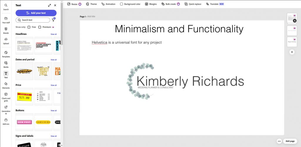
- Helvetica:
- Features: Helvetica is an iconic font that has become a symbol of minimalism and functionality. Its clean lines and neutral style make it a universal choice for any project.
Examples of use:
- Company logos (e.g., American Airlines, Toyota).
- Mobile app and website interfaces.
- Corporate materials (brochures, presentations).
Use Helvetica to create a professional and modern look.
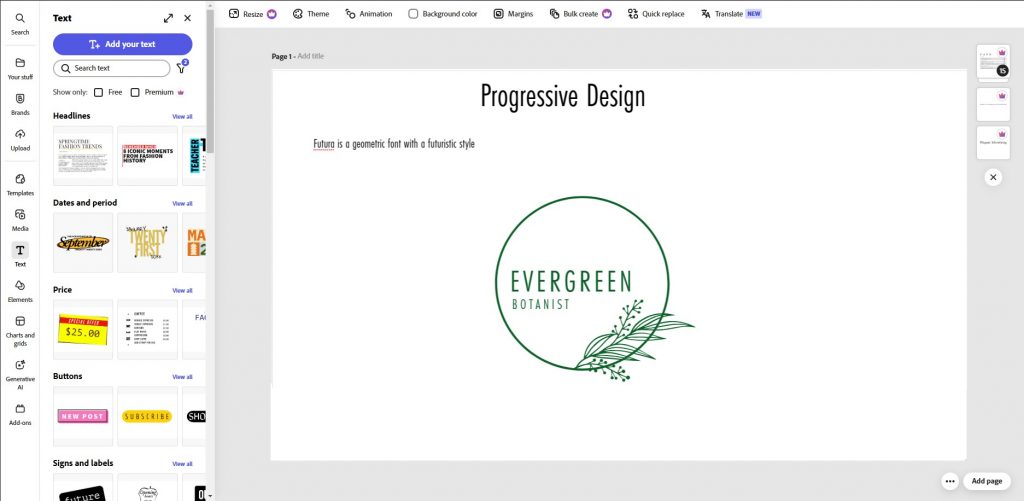
- Futura:
- Features: Futura is a geometric font based on simple forms (circles and straight lines). It conveys a futuristic and progressive mood.
Examples of use:
- Product packaging (e.g., brands like Volkswagen and Supreme).
- Posters and event flyers.
- Technical documentation and instructions.
Futura is perfect for projects where precision and structure are important.
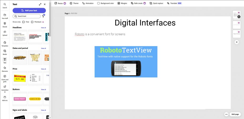
- Roboto:
- Features: Roboto was specifically designed for digital interfaces. Its soft forms and open letters make text easily readable even on small screens.
Examples of use:
- Mobile apps (especially on the Android platform).
- Websites and blogs.
- UI/UX design.
Roboto is an ideal choice for user-experience-focused projects.
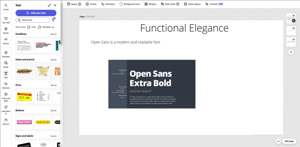
- Open Sans:
- Features: Open Sans is a modern font with excellent readability and elegant design. It combines functionality with aesthetics.
Examples of use:
- Corporate websites.
- Emails and newsletters.
- Presentations and reports.
Open Sans works well for projects where both style and readability are important.
How to Use Sans-Serif Fonts?
- For Headings and Subheadings: Sans-serif fonts are great for headings due to their clarity and focus on modernity. For example, Futura or Helvetica can help draw attention to key messages.
- In Interfaces: Roboto, Open Sans, and other sans-serif fonts ensure excellent readability on screens. They are perfect for buttons, menus, and text blocks.
- In Corporate Branding: Helvetica and Futura are often used in logos and branded materials as they convey reliability and professionalism.
- Avoid in Classic Projects: If your project is related to traditions, history, or academic themes, it’s better to choose serif fonts.
Best Decorative Fonts from Adobe Fonts
Decorative fonts are bold and memorable design elements that help attract attention and convey a unique atmosphere for a project. They are perfect for accents, headings, and special tasks where creativity and individuality are key.
What Are Decorative Fonts?
Decorative fonts differ from classic serif and sans-serif fonts with their unconventional shapes and unique designs. They are often used to create visual effects or convey specific emotions. However, their complex design makes them unsuitable for large volumes of text.
Characteristics of decorative fonts:
- Individuality: Each font has a unique style that can be playful, luxurious, or futuristic.
- Emotionality: These fonts help convey the mood of a project (e.g., romance, drama, or technology).
- Limitations: Due to their intricate design, they are hard to read at small sizes or in long texts.
Recommended Fonts:
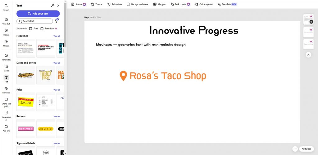
- Bauhaus:
- Features: Bauhaus is inspired by the artistic movement of the same name, combining geometry and minimalism. This font conveys a sense of progress and innovation.
Examples of use:
- Posters and flyers for modern events.
- Logos of creative agencies.
- Book and album covers with contemporary themes.
Use Bauhaus for projects related to art, architecture, or technology.
- Lobster:
- Features: Lobster is a playful handwritten font with smooth lines and soft transitions. It creates a friendly and informal atmosphere.

Examples of use:
- Logos of cafes, restaurants, and bars.
- Invitations to events (weddings, parties).
- Social media (post titles, captions).
Lobster works well for projects where warmth and ease are important.
- Bangers:
- Features: Bangers is a bold and expressive font that grabs attention with its energy. Its design resembles comics or graffiti.
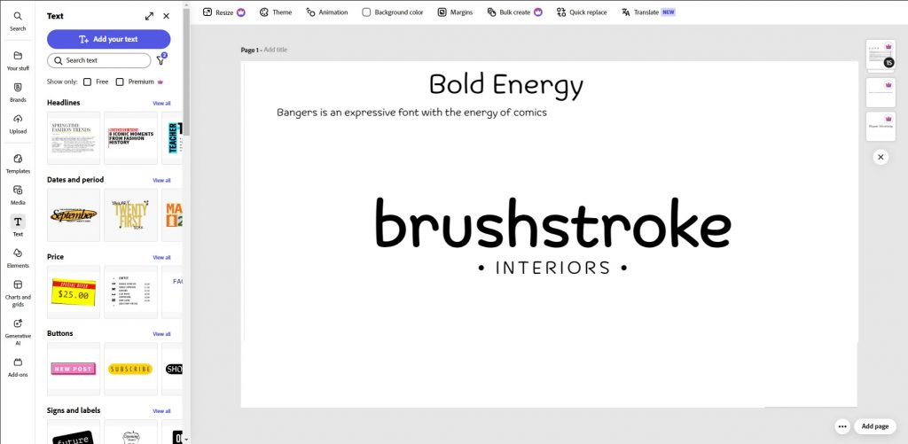
Examples of use:
- Posters and banners for youth events.
- Headlines on social media.
- Marketing materials (advertising, promotions).
Use Bangers for projects where dynamics and emotional charge are key.
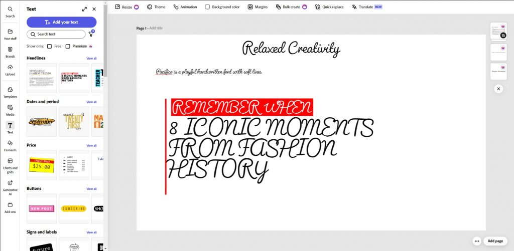
- Pacifico:
- Features: Pacifico is a handwritten font with a playful and relaxed style. It conveys a sense of freedom and creativity.
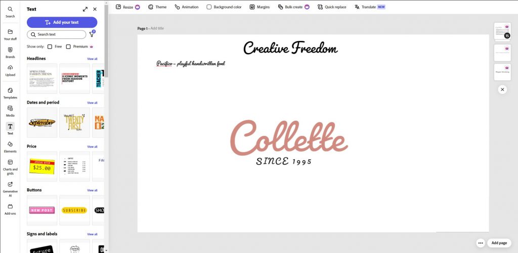
Examples of use:
- Greeting cards and invitations.
- Blogs and personal projects.
- Logos of brands targeting youth.
Pacifico is perfect for projects where lightness and individuality matter.
How to Use Decorative Fonts?
- For Headings and Accents: Decorative fonts work best in headlines, logos, and other elements that require attention. For example, Bauhaus or Bangers can become a striking accent on a poster.
- In Limited Text Volumes: Avoid using decorative fonts for body text. They can make reading difficult and strain the eyes.
- To Create Mood: Choose fonts that match the emotional tone of your project. For example, Lobster suits friendly and warm projects, while Bangers fits energetic and dynamic ones.
- Combine with Simple Fonts: To avoid overloading the design, pair decorative fonts with minimalist sans-serif fonts (e.g., Roboto or Helvetica).
Best Handwritten Fonts from Adobe Fonts
Handwritten fonts mimic natural handwriting and create a sense of personal connection. They are perfect for projects where warmth, individuality, and humanity are important. These fonts are often used in greeting cards, invitations, logos, and other materials that require an emotional connection.
What Are Handwritten Fonts?
Handwritten fonts reproduce the style of hand-drawn writing, making them unique and memorable. They can range from simple and minimalist to complex with decorative elements.
Characteristics of handwritten fonts:
- Warmth: Convey a sense of personal involvement and care.
- Individuality: Each font has its own unique style, which can be playful, elegant, or romantic.
- Limitations: Due to their complexity, they are hard to read in large volumes of text.
Recommended Fonts:
- Pacifico:
- Features: Pacifico is a playful handwritten font with soft lines and a relaxed style. It conveys a sense of freedom and creativity.
Examples of use:
- Greeting cards and invitations.
- Blogs and personal projects.
- Logos of brands targeting youth.
Pacifico works well for projects where lightness and individuality matter.
- Dancing Script:
- Features: Dancing Script combines smooth lines and elegant details. This font looks like real handwriting but with a more structured design.

Examples of use:
- Wedding themes (invitations, menus).
- Quotes and captions.
- Logos of companies focused on family values.
Use Dancing Script to create an elegant and warm atmosphere.
- Great Vibes:
- Features: Great Vibes is a luxurious handwritten font with detailed swirls. It is perfect for formal events and ceremonial projects.

Examples of use:
- Invitations to weddings and corporate events.
- Book and magazine covers.
- Logos of premium brands.
Great Vibes adds luxury and elegance to any project.
- Caveat:
- Features: Caveat is a modern handwritten font with a casual style. Its design resembles natural handwriting, making it ideal for informal projects.
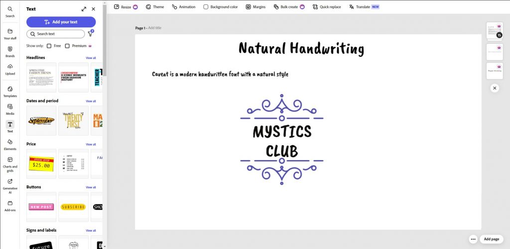
Examples of use:
- Social media posts.
- Children’s books and materials.
- Marketing campaigns focusing on personal connection.
Caveat suits projects where a friendly and open atmosphere is important.
How to Use Handwritten Fonts?
- To Create a Warm Atmosphere: Handwritten fonts help convey a sense of humanity and personal involvement. For example, Dancing Script works great for wedding invitations.
- In Limited Text Volumes: Avoid using handwritten fonts for body text. They work better in headings, quotes, or captions.
- To Convey Emotions: Choose fonts that match the emotional tone of your project. For example, Great Vibes suits formal events, while Pacifico fits informal projects.
- Combine with Simple Fonts: To avoid overloading the design, pair handwritten fonts with minimalist sans-serif fonts (e.g., Roboto or Open Sans).
How to Properly Combine Fonts?
Combining fonts is an art that allows you to create harmonious and visually appealing designs. Properly paired fonts help amplify the message, divide content into logical blocks, and add individuality to a project. However, incorrect combinations can make the design cluttered and difficult to perceive.
Basic Rules for Combining Fonts
- Contrast Rule: Use fonts with different characteristics (e.g., serif + sans-serif). Contrast helps highlight key elements and create balance. Example: Bodoni (serif) + Helvetica (sans-serif).
- Limit the Number of Fonts: Do not use more than 2–3 fonts in one project. This will help avoid chaos and maintain design integrity. Exception: Decorative fonts can be used as accents.
- Maintain Hierarchy: Divide text into headings, subheadings, and body text. Each level should be styled appropriately. Example: Futura (headings) + Open Sans (body text).
- Consider Project Style: Choose fonts that match the theme and mood of the project. For example, modern sans-serif fonts suit tech brands, while serif fonts work well for classic publications.
Examples of Successful Combinations:
- Bodoni + Helvetica: Features: Classic meets modern. Bodoni adds elegance, while Helvetica ensures clarity and functionality. Examples of use: Logos, advertising materials, presentations.
- Garamond + Futura: Features: Tradition meets innovation. Garamond brings warmth, while Futura adds a modern touch. Examples of use: Magazines, books, corporate websites.
- Playfair Display + Roboto: Features: Luxury meets minimalism. Playfair Display is perfect for headings, while Roboto ensures excellent readability for body text. Examples of use: Blogs, portfolios, websites.
- Lobster + Open Sans: Features: Warmth meets practicality. Lobster creates a friendly atmosphere, while Open Sans adds professionalism. Examples of use: Cafes, restaurants, social media.
How to Avoid Mistakes When Combining Fonts?
- Avoid Too Similar Fonts: If two fonts are too similar, they will compete for attention, creating a sense of clutter. Example: Do not combine two serif fonts with the same line thickness.
- Do Not Overload the Design: Even if you use only two fonts, it’s important to maintain balance. For example, do not make all headings bold if the main text is already saturated.
- Check Readability: Ensure that the selected fonts are readable on all devices and at different sizes.
How to Start Using Adobe Fonts?
Adobe Fonts is a powerful tool for designers, providing access to thousands of professional fonts. To use the entire collection, you need to follow a few simple steps. Let’s explore the process step by step.
Creating an Adobe Creative Cloud Account
- Go to the official Adobe Creative Cloud website .
- Click “Try for Free” or “Buy” to create an account.
- Fill out the registration form, providing your email address and password.
- Confirm your account via the email sent to your inbox.
Accessing Adobe Fonts
- After logging in, go to the “Fonts” section on the Adobe website.
- Use the search function to find the desired font by name, category, or characteristics (e.g., serif, sans-serif, decorative).
- View font details: usage examples, supported languages, and technical specifications.
Activating Fonts
- Click the “Activate” button next to the selected font.
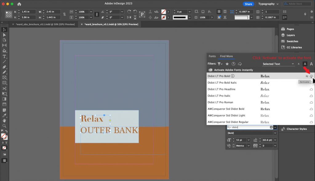
- The font will automatically sync with your Adobe applications (Photoshop, Illustrator, InDesign, etc.).
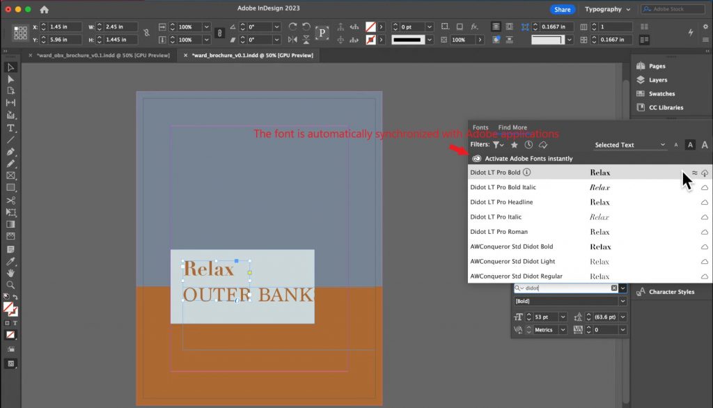
- If you’re using the font for web design, copy the CSS code from the “Web Projects” section.

Using Fonts in Projects
- Print Materials: Open a document in Adobe Illustrator or InDesign. Select the activated font from the list of available options. Apply it to headings, subheadings, or body text.
- In Web Design: Paste the CSS code into your website’s HTML file. Ensure the font displays correctly on all devices.
- Interfaces: Use fonts in Figma or Adobe XD to create app and website layouts.
Tips for Using Adobe Fonts
- Organize Your Font Library:
- Create font collections for different projects (e.g., logos, web design, print materials).
- Use Filters:
- Filters help quickly find fonts by style, classification, or popularity.
- Update Your Library:
- Adobe constantly adds new fonts. Regularly check for updates to stay informed about the latest releases.
Why Adobe Fonts Is Your Best Choice?
Adobe Fonts offers a unique opportunity to access thousands of professional fonts suitable for any project — from web design to print materials. The collection is constantly updated, providing designers with tools to bring their boldest ideas to life.
Advantages of Adobe Fonts
- Wide Selection: The collection includes serif, sans-serif, decorative, and handwritten fonts, allowing you to find the perfect option for any project.
- Ease of Use: Fonts are easy to activate and automatically sync with Adobe applications.
- Professional Quality: All fonts are designed by experts and support multiple languages.
- Integration with Creative Cloud: Ability to use fonts in Photoshop, Illustrator, InDesign, and other Adobe tools.
How to Use Adobe Fonts for Success?
Choose fonts that align with the goals and objectives of your project.
Experiment with font combinations to create a unique style.
Regularly explore new fonts and updates in the Adobe Fonts collection.
Call to Action
Start using Adobe Fonts today to enhance your projects and stand out from the competition. With the right fonts, your designs will become more professional, emotional, and memorable.


Leave a Reply