
Why is UI/UX Design So Important?
UI/UX design is not just a beautiful shell for a product; it’s the foundation that determines its success or failure. Usability, conversions, and user satisfaction directly depend on how well the interface and user experience are thought out.
When I first worked on an app, I neglected UX, and users complained about difficult navigation. It was hard to find the right features, and the interface felt overloaded. After a redesign focused on simplifying navigation and improving the user experience, the number of active users increased by 40%! This clearly shows how important it is to pay attention to UI/UX from the very beginning of development.
In this article, we’ll cover the best practices for creating effective interfaces. You’ll learn the difference between UI and UX, the design principles that improve usability, the tools to use for your work, and how to apply these insights in practice. We’ll also analyze examples of successful projects and mistakes to avoid.v
What Are UI and UX, and How Do They Differ?
UI (User Interface) and UX (User Experience) are two key components of design that are often confused. However, their roles in product development are different. UI is responsible for the visual appearance, while UX focuses on emotional perception and usability. Let’s break down each of them in detail.
UI (User Interface): Visual Component
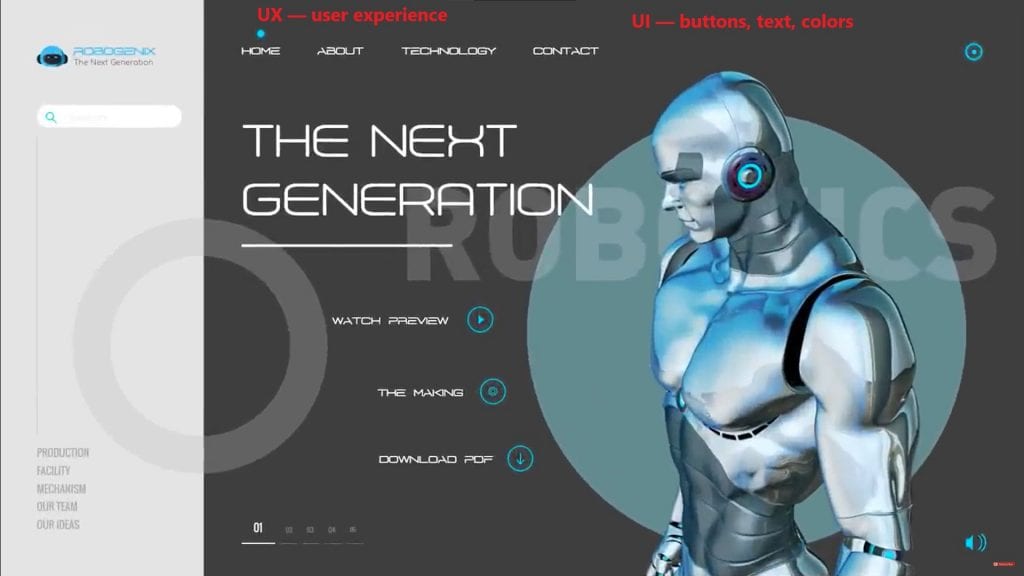
UI (user interface) is what the user sees and interacts with. These are buttons, text fields, menus, icons, and other interface elements. Good UI makes a product attractive and intuitive.
How does UI affect product perception?
Visual design creates the first impression. If the interface looks messy or outdated, users may abandon the product without even trying its features.
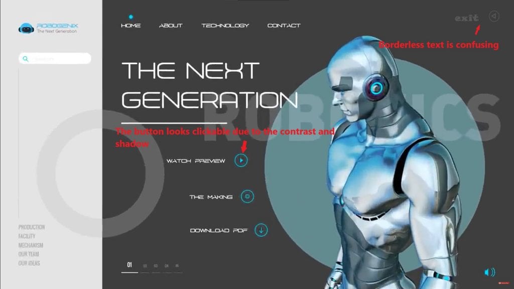
Interface elements should be recognizable. For example, a button should look clickable so that the user immediately understands it can be pressed.
Good UI is when a button looks clickable.
If a button has clear borders, a contrasting color, and a shadow, the user intuitively understands it’s an interactive element. If the button looks like plain text, it will cause confusion.
UX (User Experience): Emotional Component
UX (user experience) is how the user interacts with the product and what emotions they experience during the process. Good UX makes using the product pleasant, simple, and efficient.
How does UX shape user perception?
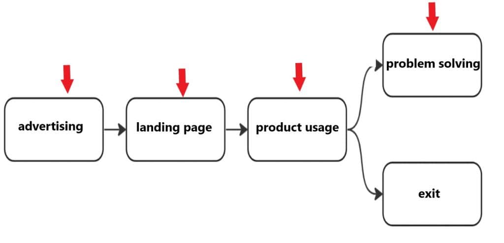
- UX includes all user interactions with the product, from the first contact to task completion. For example, if a user quickly finds the information they need and completes a task without unnecessary steps, it positively impacts their impression.
- Poor UX can lead to frustration. For instance, if a registration form is too complicated or a page loads slowly, the user may leave the site.
UX includes all user interactions with the product, from the first contact to task completion.
This means that UX begins the moment the user learns about the product (e.g., through advertising) and continues until they use it to solve their tasks. Every step of this journey must be carefully planned and optimized.
How to Create an Effective Interface
Creating an effective interface requires adhering to a set of principles that make the product both convenient and appealing. In this section, we’ll explore three key aspects: minimalism, the use of color and contrast, and consistency and uniformity.
Minimalism and Simplicity
Minimalism is not just a trendy approach but a practical design philosophy that helps users focus on the key features of a product.
Why is less more?
The fewer elements on the screen, the easier it is for users to navigate. An overload of information or elements can overwhelm perception and cause stress.
A simple interface loads faster and is easier to maintain. This is especially important for mobile apps, where performance plays a crucial role.
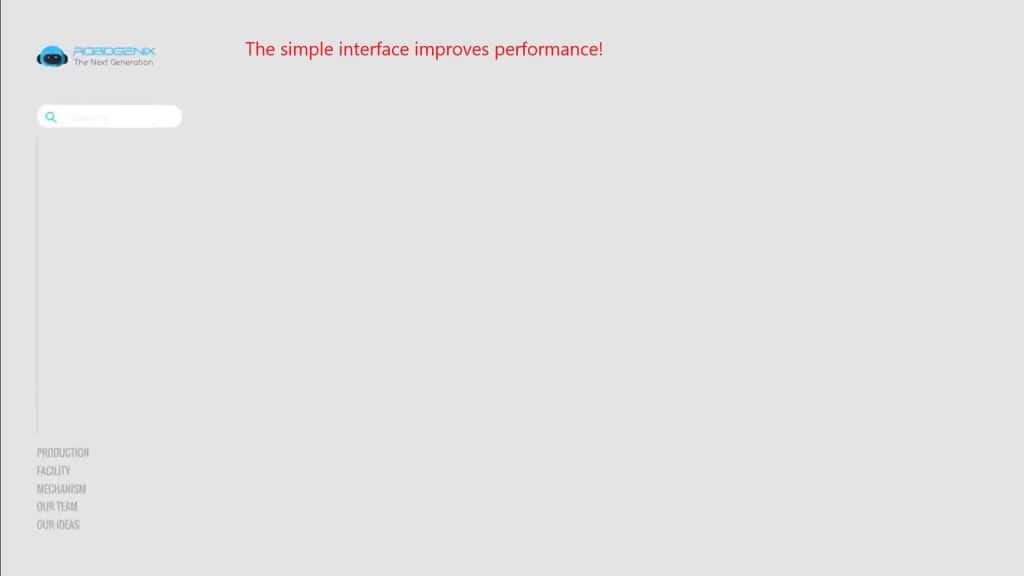
Minimalism helps users focus on key features.
For example, if there’s only one button, “Sign Up,” on the main page, users will immediately understand that this is the primary task. If the page is cluttered with buttons, links, and text, users may get confused and leave.
Use of Color and Contrast
Color and contrast play a crucial role in how users perceive an interface. Proper use of color helps highlight important elements and makes the design more user-friendly.
How to choose colors for buttons, text, and background?
- Accent colors: Use bright colors for key elements like “Buy” or “Sign Up” buttons. For instance, red or orange attracts attention.
- Background colors: The background should be neutral (e.g., light gray or white) so it doesn’t distract users from the main content.
- Contrast: Ensure the text is clearly visible against the background. Use tools like WebAIM Contrast Checker to verify this.
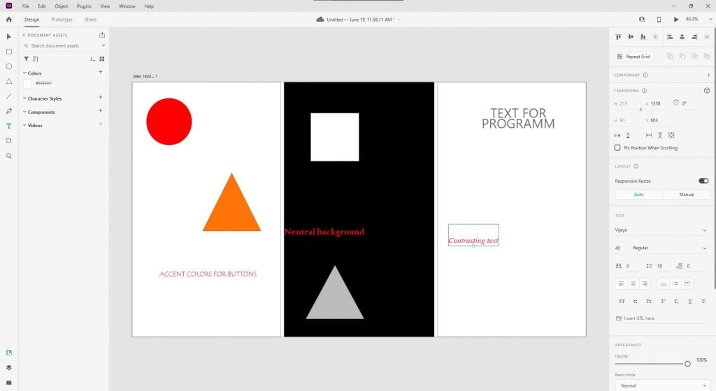
Use bright colors for accents and neutral colors for the background.
For instance, if the “Submit” button is green and the background is light gray, users will immediately recognize it as a key element. If the button blends into the background, it becomes invisible
Consistency and Uniformity
Consistency and uniformity are the foundation of good UI design. They help create a predictable and convenient interface that’s easy to use.
Why is it important to maintain a consistent style across all interface elements?
When all elements look the same, users learn to use the product faster. For example, if all buttons have the same size, color, and shape, users immediately understand their purpose.
Inconsistent design can cause confusion. For instance, if headings are bold on one page and italicized on another, it creates a sense of chaos.
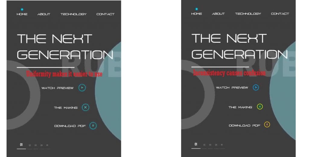
Create a component library for reuse.
A component library is a set of ready-made design elements (buttons, forms, menus) that can be used in different parts of the product. This ensures that all elements look the same and align with the overall style.
Consistency and Uniformity
Consistency and uniformity are the foundation of good UI design. They help create a predictable and convenient interface that’s easy to use.
Why is it important to maintain a consistent style across all interface elements?
When all elements look the same, users learn to use the product faster. For example, if all buttons have the same size, color, and shape, users immediately understand their purpose.
Inconsistent design can cause confusion. For instance, if headings are bold on one page and italicized on another, it creates a sense of chaos.
Create a component library for reuse.
A component library is a set of ready-made design elements (buttons, forms, menus) that can be used in different parts of the product. This ensures that all elements look the same and align with the overall style.
How to Improve User Experience
Successful UX design starts with a deep understanding of users and their needs. In this section, we’ll explore three key aspects: user research, intuitive navigation, and design testing.
User Research
User research is the first step in creating a product that truly solves the problems of your target audience. Without understanding who your users are and how they interact with your product, it’s impossible to create a successful UX.
How to conduct interviews and analyze user behavior?
- Interviews: Conduct personal or online interviews with users to learn about their goals, pain points, and expectations. Ask open-ended questions like: “How do you usually use this product?” or “What frustrates you about current solutions?”
- Behavioral analysis: Use analytical tools like Google Analytics or Hotjar to track user actions on your site. For example, if users frequently leave a page after viewing a specific section, it may indicate a problem with content or design.
- Personas: Create fictional personas that represent typical users of your product. This will help you better understand their needs and motivations.
Understanding the target audience is the key to successful UX.
When you know who your users are and what they expect from the product, you can adapt the design to their needs. For example, if your audience consists of elderly people, it’s important to use large fonts and simple navigation.
Creating Intuitive Navigation
Navigation is the foundation of any product. If users can’t quickly find what they’re looking for, they’re likely to leave the site or app.
How to make navigation clear and convenient?
- Simplicity: Limit the number of menu items to 5–7. This will help users find information faster.
- Accessibility: The main menu should be accessible from any page. This allows users to easily navigate the site, no matter where they are.
- Hierarchy: Use visual hierarchy to highlight important elements. For example, headings should be larger, and buttons like “Buy” or “Sign Up” should stand out.
The main menu should be accessible from any page.
If a user lands on a product page and wants to return to the homepage, they should be able to do so with one click. Hidden or complex navigation can lead to users simply leaving the site.
Testing and Iterations
Testing is an integral part of UX design. Even the most well-thought-out design may not work as expected if it isn’t tested on real users.
Why is it important to test the design on real users?
Real users can uncover issues you didn’t anticipate. For example, a button might be hard to notice, or text might be difficult to read.
Testing helps validate hypotheses and improve the design based on feedback.
Conduct A/B testing to validate hypotheses.
A/B testing allows you to compare two design versions and determine which one performs better. For example, you can test two versions of a “Buy” button — one green, the other red — to see which attracts more clicks.
Tools for UI/UX Design
To create a successful UI/UX design, it’s important to use the right tools. In this section, we’ll explore popular programs, ways to create prototypes, and how to use analytics to improve your design.
Popular Programs
There are many tools for UI/UX design, but some stand out due to their functionality and ease of use.
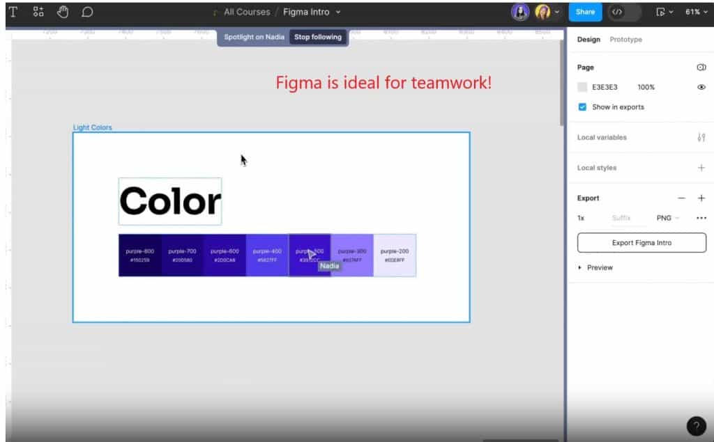
- Figma:
- This cloud-based app is perfect for team collaboration. All project participants can edit the design simultaneously, significantly speeding up the development process.
- Theory: “Figma is ideal for team collaboration thanks to cloud synchronization.”
- Figma also offers built-in prototyping and testing tools, making it a versatile solution.
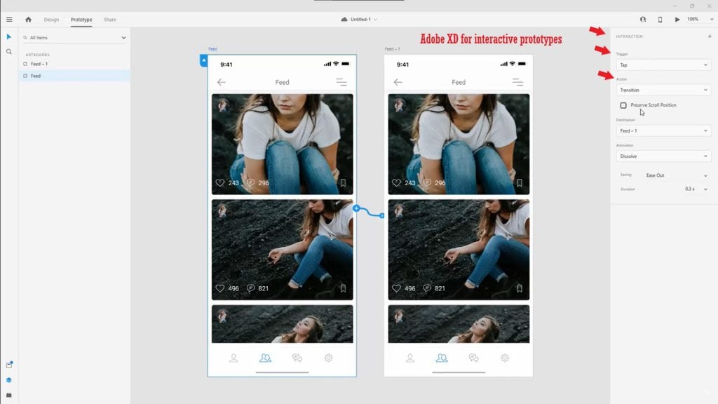
2. Adobe XD:
This tool is designed specifically for designers working with Adobe products. It allows you to create interactive prototypes and easily export them for developers.
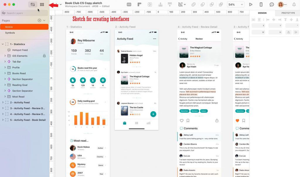
3. Sketch:
Sketch is popular among designers working on macOS. It offers powerful tools for creating interfaces and component libraries.
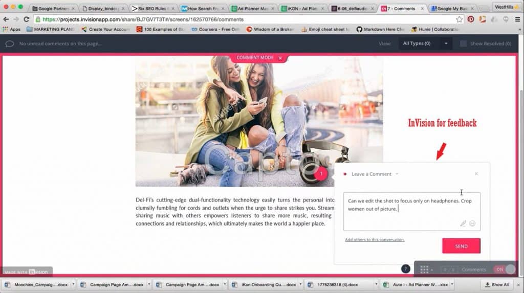
4. InVision:
This platform is used to create interactive prototypes and gather feedback. InVision is especially useful for presenting designs to clients or teams.
Each of these tools has its advantages, and the choice depends on your needs and preferences.
Prototyping
Prototyping is an important stage in the development process that helps visualize ideas and gather feedback before implementation.
How to create prototypes and gather feedback?
- Start simple: Create a low-fidelity prototype (e.g., wireframes) to test basic ideas. This helps quickly identify potential issues.
- Move to interactive prototypes: Once the basic structure is ready, add interactivity to show how interface elements will work. For example, add transitions between pages or button animations.
- Gather feedback: Share the prototype with colleagues, clients, or users to get their opinions. Use comments and suggestions to improve the design.
Use interactive prototypes to demonstrate functionality.
Interactive prototypes allow users to “test” the product even if it’s not ready yet. This helps better understand how the final product will work and fix issues at an early stage.
Data Analysis
Analytics is a powerful tool that helps improve design based on real data about user behavior.
How to use analytics to improve your design?
- Track user actions: Use tools like Google Analytics to understand which pages are visited most often and where users spend more time.
- Identify problem areas: Tools like Hotjar or Crazy Egg allow you to see heatmaps and recordings of user actions. This helps identify moments where users experience difficulties.
- Implement changes: Based on the collected data, make changes to the design. For example, if users frequently leave the site on the checkout page, you may need to simplify the form.
Hotjar helps understand where users experience difficulties.
With heatmaps, you can see which page elements attract attention and which are ignored. This allows you to optimize the placement of buttons, menus, and other key elements.
Lessons from Real-World Projects
Analyzing successful interfaces helps understand which design principles work in practice. In this section, we’ll explore examples from well-known companies, mistakes to avoid, and ways to apply these lessons to your project.
Analysis of Successful Interfaces
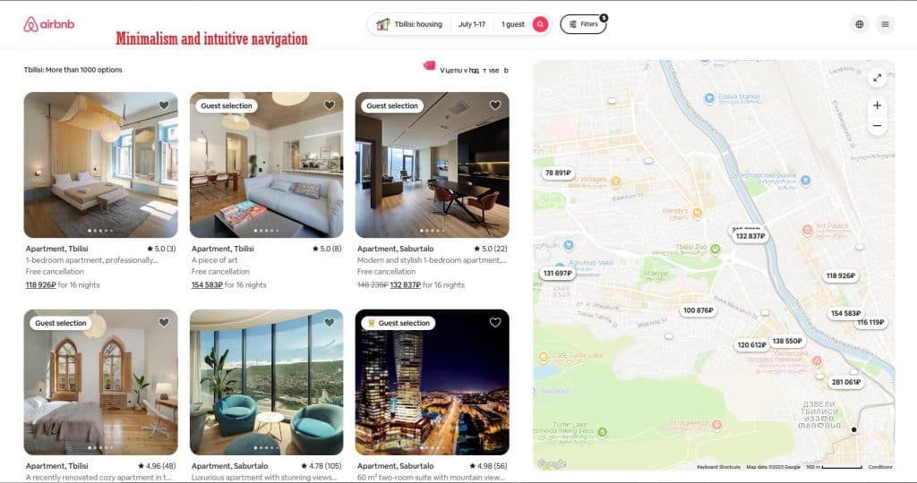
Airbnb:
Airbnb is a prime example of how minimalism and intuitive navigation can make a product both convenient and appealing.
Airbnb uses minimalistic design and intuitive navigation.
The Airbnb interface is simple and clear: users can quickly find accommodation, filter results, and book it in just a few clicks. Key elements are highlighted clearly, while unnecessary details are excluded.
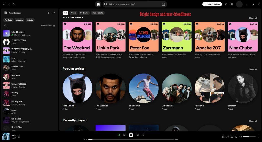
Spotify:
Spotify stands out with its vibrant and dynamic design that maintains usability.
The main menu is always accessible, allowing users to easily switch between playlists, recommendations, and settings.
The color scheme (green accents on a dark background) creates a unique style and makes the interface memorable.
Google Maps:
Google Maps demonstrates how complex features can be presented in a simple form.
The map takes up most of the screen, while control buttons are compactly and logically arranged.
Users can easily find routes, add markers, and view information about places.
These companies show that success depends on balancing beauty and functionality.

Mistakes to Avoid
Even large companies sometimes make design mistakes. Here are a few examples worth considering:
- Overloading with elements:
Too much information or too many elements on one page can confuse users. For example, if the homepage has dozens of links, buttons, and text blocks, users won’t be able to focus on key tasks.
Too many elements on one page can confuse users.
This is especially important for mobile apps, where screen space is limited.
- Inconsistency:
If the same element looks different on different pages, it causes confusion. For instance, the “Buy” button should have the same color and shape across all pages.
- Neglecting testing:
Even the most well-thought-out design may not work as expected. Without testing on real users, it’s hard to predict what issues will arise during use.
By avoiding these mistakes, you can create a higher-quality product.
How to Apply These Lessons to Your Project
Successful projects offer many useful ideas, but it’s important to adapt them to your needs.
Study competitors, but don’t copy them completely.
- Competitor analysis:
Study the interfaces of successful products in your niche. Pay attention to how they handle navigation, color palettes, and user interactions. - Focus on uniqueness:
While competitor analysis is important, your product should stand out. For example, if all your competitors use cold colors, try adding warm tones to create a unique atmosphere. - Testing and iterations:
After implementing new ideas, test them on real users. Gather feedback and make changes based on the data you collect.
These steps will help you create a product that is both convenient and memorable.
Finally
In this article, we covered the key aspects of creating successful UI/UX design. We started with the basics, explaining the difference between UI and UX, and discussed the importance of minimalism, proper use of color and contrast, and consistency in the interface. Then, we delved into methods for improving user experience, such as user research, intuitive navigation, and design testing. We also explored popular tools for work, analyzed successful projects, and highlighted mistakes to avoid.
Apply these practices in your next project and improve the user experience!
Use minimalism to focus on key features, conduct user research to better understand their needs, and don’t forget to test your design on real users. These steps will help you create a product that is convenient, appealing, and effective.


Leave a Reply